
Web Accessibility Best Practices for Developers in 2026: Build Inclusive UIs
A practical guide for frontend developers on implementing web accessibility best practices in 2026, covering WCAG standards, semantic HTML, ARIA roles, and testing tools to create truly inclusive user interfaces.
Keywords: Web Accessibility, WCAG, Inclusive UI Design
TABLE OF CONTENTS
1. Introduction: Why Accessibility is Non-Negotiable in 2026
2. The Core Pillars of Web Accessibility
3. Solving Common Accessibility Challenges
4. Practical Application: Tools and Integration
5. Frequently Asked Questions (FAQ)
6. Conclusion: Building a More Inclusive Web
INTRODUCTION
Why Accessibility is Non-Negotiable in 2026
In the rapidly evolving digital landscape of 2026, web accessibility, often abbreviated as A11y, is no longer merely a best practice or an optional add-on; it’s a fundamental requirement for any successful web presence. As frontend developers, we are at the forefront of crafting user experiences, and ensuring these experiences are inclusive for everyone, regardless of their abilities, is paramount. This goes beyond ethical considerations; it encompasses legal compliance, market reach, and overall user satisfaction.
Consider the sheer scale: globally, over 1.3 billion people live with some form of disability, representing approximately 16% of the world’s population. This demographic has significant purchasing power, estimated at over $13 trillion annually. Excluding them from accessing your digital products not only alienates a massive user base but also leaves substantial economic value on the table. Furthermore, accessible design often benefits a much wider audience, including people using mobile devices in bright sunlight, individuals with temporary injuries, or older adults experiencing age-related changes.
The legal landscape for web accessibility has also matured significantly. In 2026, many jurisdictions enforce stringent accessibility regulations, often based on the Web Content Accessibility Guidelines (WCAG) 2.2. Non-compliance can lead to costly lawsuits, reputational damage, and significant remediation efforts. For instance, in the United States, lawsuits related to website accessibility under the Americans with Disabilities Act (ADA) continue to rise, with thousands of cases filed annually. European Union directives and national laws in countries like Canada and Australia similarly mandate digital accessibility.
Web accessibility in 2026 is driven by ethical responsibility, significant market opportunity (16% of global population), and increasingly strict legal compliance, primarily guided by WCAG 2.2 standards.
This guide is designed to equip frontend developers with the practical knowledge and best practices needed to build truly inclusive user interfaces in 2026. We will dive into the foundational principles of WCAG 2.2, explore essential techniques like semantic HTML and ARIA, discuss common challenges, and introduce effective testing methodologies.
CORE CONCEPTS
The Core Pillars of Web Accessibility
Building an accessible web experience relies on several interconnected principles. At its heart are the WCAG 2.2 guidelines, structured around four core principles: Perceivable, Operable, Understandable, and Robust (POUR). These principles provide a framework for creating content that can be accessed and interacted with by a diverse range of users.
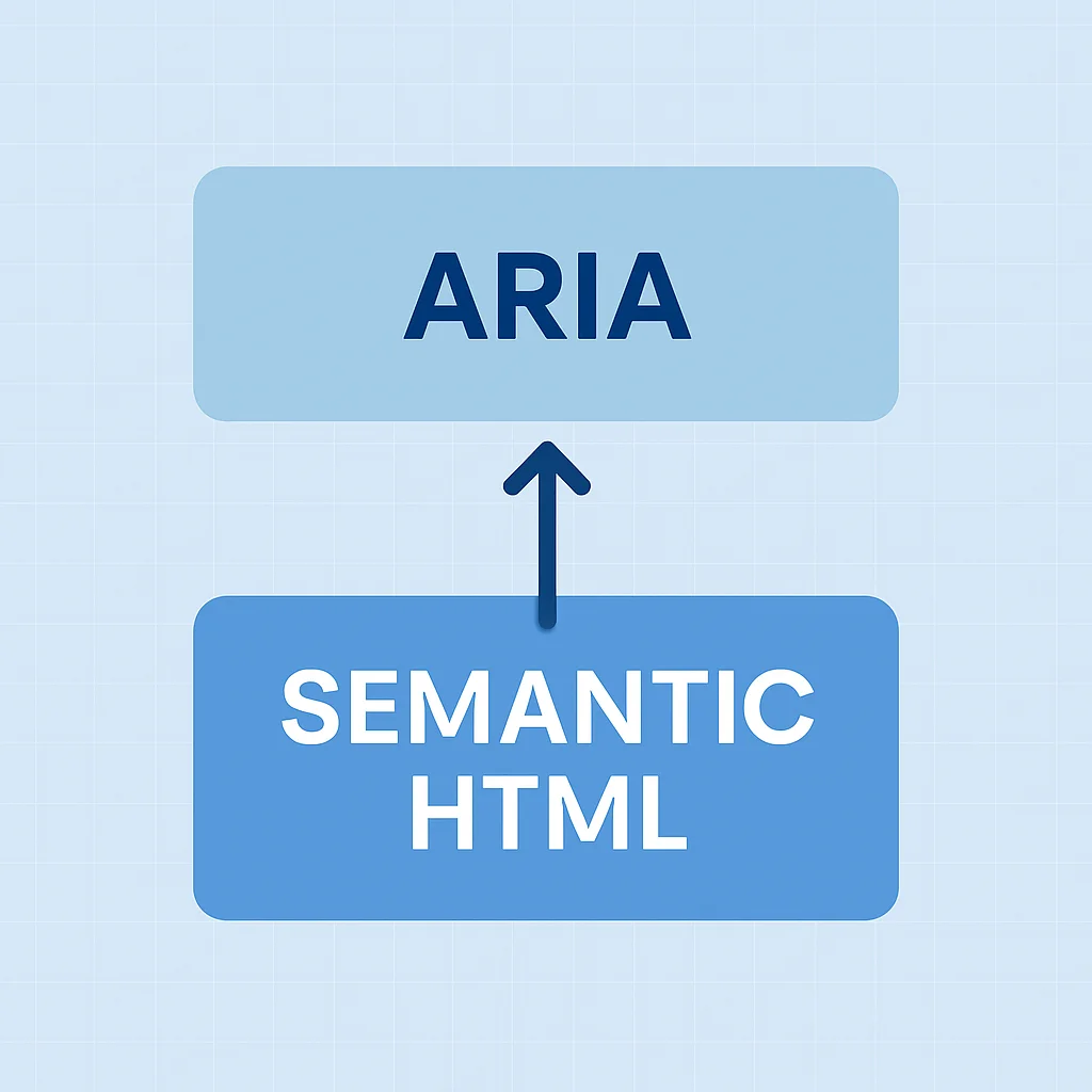
1. Semantic HTML: The Foundation of Accessibility
Semantic HTML is the bedrock of an accessible web. By using HTML elements for their intended purpose, we convey meaning and structure to assistive technologies like screen readers, search engines, and other user agents. This inherent semantic value reduces the need for complex ARIA attributes and often provides accessibility out-of-the-box.
For example, using a <button> element for a clickable action automatically provides keyboard focus, click event handling, and correct role semantics to assistive technologies. In contrast, a <div> styled to look like a button would require significant manual effort (adding role="button", tabindex="0", and keyboard event listeners) to achieve the same level of accessibility.
Key semantic elements to leverage:
<header>,<nav>,<main>,<aside>,<footer>: For defining document structure and navigation landmarks.<h1>to<h6>: For clear heading hierarchies that outline content structure.<img alt="...">: Always include descriptivealtattributes for images.<form>,<label>,<input>,<select>,<textarea>: For well-structured and labeled forms.<ul>,<ol>,<dl>: For lists to convey relationships.
2. ARIA Roles and Attributes: Enhancing Semantics
ARIA (Accessible Rich Internet Applications) is a set of attributes that define ways to make web content and web applications more accessible to people with disabilities. It is crucial for dynamic content and custom UI components that lack inherent semantic meaning. However, the first rule of ARIA is: “If you can use a native HTML element or attribute with the semantics and behavior you require, do so instead.”
ARIA roles define the type of UI element (e.g., role="alert", role="dialog", role="tablist"), while ARIA states and properties (attributes) provide additional information about their current condition or characteristics (e.g., aria-expanded="true", aria-hidden="true", aria-live="polite").
3. Keyboard Navigation: Operability for All
Many users, including those with motor disabilities, blind users, and power users, rely exclusively on keyboard navigation. Every interactive element on your page must be reachable and operable using only the keyboard. This means ensuring proper tabindex management, visible focus indicators, and logical tab order.
WCAG 2.2 Success Criterion 2.1.1 Keyboard mandates that all functionality of the content is operable through a keyboard interface without requiring specific timings for individual keystrokes. Furthermore, 2.4.7 Focus Visible requires that any user interface component that can be operated through a keyboard interface has a mode of operation where the keyboard focus indicator is visible.
Best practices for keyboard navigation:
- Use native interactive elements:
<a>,<button>,<input>naturally support keyboard interaction. - Manage
tabindexcarefully:tabindex="0": Allows an element to be focusable and part of the natural tab order.tabindex="-1": Allows an element to be programmatically focusable (e.g., via JavaScript) but removes it from the natural tab order. Useful for managing focus in modals or dynamic content.- Avoid
tabindex=">0": Positive tabindex values disrupt the natural tab order and should generally be avoided as they create confusion.
- Visible Focus: Ensure
:focusstyles are clear and distinct. - Skip Links: Provide a “Skip to main content” link for users to bypass repetitive navigation.
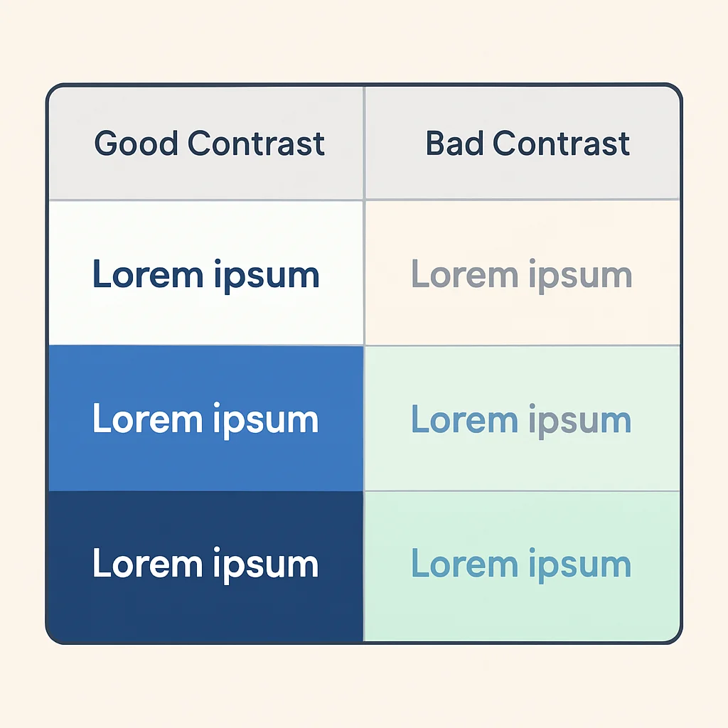
4. Color Contrast and Typography: Perceivable Content
Visual clarity is essential for users with low vision, color blindness, or cognitive disabilities. WCAG 2.2 provides specific guidelines for color contrast ratios and text presentation.
Color Contrast:
- Minimum (AA Level): Text and images of text must have a contrast ratio of at least 4.5:1. Large text (18pt or 14pt bold) requires 3:1.
- Enhanced (AAA Level): Text and images of text must have a contrast ratio of at least 7:1. Large text requires 4.5:1.
- Non-text elements: User interface components (e.g., input fields, buttons) and graphical objects (e.g., parts of charts, icons) must have a contrast ratio of at least 3:1 against adjacent colors.
Tools like WebAIM’s Contrast Checker or Lighthouse can help verify these ratios. Avoid using color as the sole means of conveying information.
Typography:
- Font Size: Ensure text is resizable up to 200% without loss of content or functionality (WCAG 1.4.4). Default body text should generally be at least 16px.
- Line Height and Spacing: Provide adequate line height (at least 1.5 times the font size for body text), letter spacing, and word spacing. WCAG 2.2 adds 1.4.12 Text Spacing, allowing users to override these settings.
- Font Choice: Opt for legible fonts (sans-serif often preferred) and avoid overly decorative or condensed typefaces for body text.
- Justification: Left-aligned text is generally easier to read for most users than justified text.
5. Accessible Forms: User Input for Everyone
Forms are critical for interaction, and their accessibility directly impacts user engagement and conversion. Key considerations include:
- Labels: Always associate labels with their input fields using the
<label for="id">attribute. This ensures screen readers announce the label when the input is focused. Placeholder text is not a substitute for a label. - Instructions: Provide clear instructions, especially for complex fields or required inputs. Use
aria-describedbyto link descriptions to inputs. - Error Handling: Clearly indicate errors, describe what went wrong, and suggest how to fix it. Errors should be communicated visually (e.g., red borders) and programmatically (e.g., using
aria-invalid="true"and live regions). - Input Types: Use appropriate HTML5 input types (e.g.,
type="email",type="tel",type="date") to leverage native browser features and improve usability for various devices. - Fieldsets and Legends: Group related form controls (e.g., radio buttons or checkboxes) using
<fieldset>and<legend>for semantic grouping.
CODE EXPLANATION
An example of an accessible form input with proper labeling, instructions, and error indication.
<div>
  <label for="emailInput">Email Address:</label>
  <input
    type="email"
    id="emailInput"
    name="email"
    required
    aria-describedby="emailHint emailError"
    aria-invalid="true"
  >
  <p id="emailHint" style="font-size: 14px; color: #868e96; padding-top: 4px;">
    We'll never share your email with anyone else.
  </p>
  <p id="emailError" role="alert" style="font-size: 14px; color: #e03131; padding-top: 4px;">
    Please enter a valid email address.
  </p>
</div>
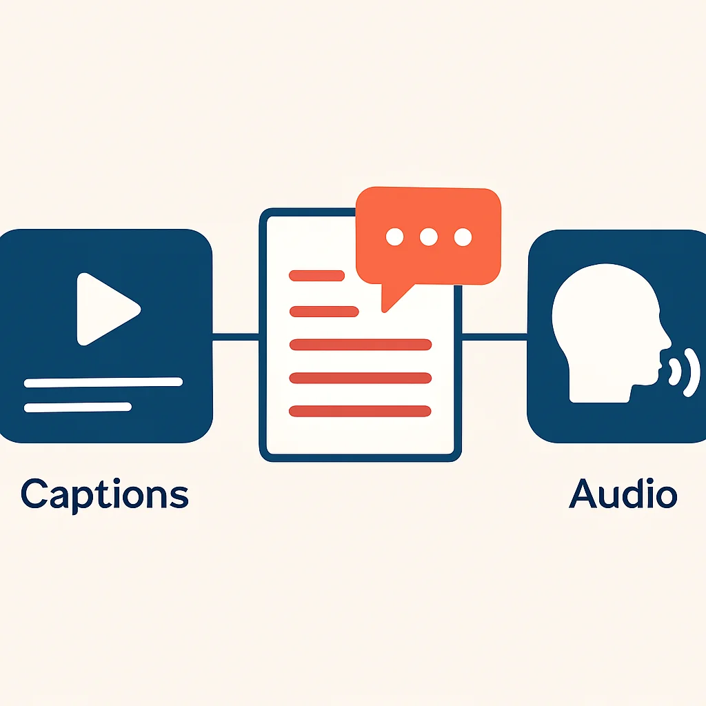
6. Multimedia Accessibility: Engaging All Senses
For audio and video content, accessibility means providing alternatives for those who cannot perceive the original medium.
- Captions: Essential for video content, providing a text equivalent of spoken dialogue and important sound effects for deaf or hard-of-hearing users.
- Transcripts: A full text version of audio or video content, beneficial for deaf-blind users, those who prefer to read, or for search engines.
- Audio Descriptions: For video content where visual information is critical and not conveyed by dialogue (e.g., action scenes, on-screen text), an audio track describing these visual elements is necessary for blind or low-vision users.
- Sign Language: For some content, especially public service announcements, providing a sign language interpreter can be highly beneficial.
PROBLEM SOLVING
Solving Common Accessibility Challenges
Even with a solid understanding of best practices, developers frequently encounter specific challenges when implementing accessibility. Let’s address some common scenarios.
PROBLEM 01
Dynamic Content Updates
When content changes on the page without a full page reload (e.g., search results, notification messages, live updates), screen readers may not automatically announce these changes, leaving users unaware.
SOLUTION — Use ARIA Live Regions
ARIA live regions (aria-live) are specifically designed to inform assistive technologies about dynamic updates. The aria-live attribute can be set to polite (for non-urgent updates) or assertive (for critical, time-sensitive updates). Additionally, roles like status, alert, and log can provide more specific semantics.
CODE EXPLANATION
This example demonstrates a simple notification area that uses aria-live="polite" to announce new messages to screen reader users without interrupting their current task.
<div id="status-message" aria-live="polite" style="padding: 10px; border: 1px solid #ccc; border-radius: 4px;">
  <!-- Dynamic messages will appear here -->
</div>

<button onclick="updateStatus('Item added to cart!')">Add to Cart</button>
<button onclick="updateStatus('Loading complete.')">Load Data</button>

<script>
  function updateStatus(message) {
    const statusDiv = document.getElementById('status-message');
    statusDiv.textContent = message;
  }
</script>
PROBLEM 02
Complex Custom Components
Building bespoke UI components (e.g., custom dropdowns, sliders, tabs) using non-semantic divs often strips away inherent accessibility, making them unusable for many users.
SOLUTION — Follow ARIA Authoring Practices Guide (APG)
The W3C’s ARIA Authoring Practices Guide (APG) is an invaluable resource for designing and implementing accessible custom components. It provides detailed patterns for common widgets, including required ARIA roles, states, properties, and keyboard interaction models. By adhering to these patterns, developers can ensure their custom components behave predictably for assistive technologies.
CODE EXPLANATION
This simplified example for an accessible tab component demonstrates how ARIA roles (tablist, tab, tabpanel) and states (aria-selected, aria-controls, aria-labelledby) are used to make the component navigable and understandable.
<div role="tablist" aria-label="Content Tabs">
  <button
    role="tab"
    aria-selected="true"
    aria-controls="panel-1"
    id="tab-1"
    tabindex="0"
  >
    Tab 1
  </button>
  <button
    role="tab"
    aria-selected="false"
    aria-controls="panel-2"
    id="tab-2"
    tabindex="-1"
  >
    Tab 2
  </button>
</div>

<div id="panel-1" role="tabpanel" aria-labelledby="tab-1">
  <p>Content for Tab 1.</p>
</div>
<div id="panel-2" role="tabpanel" aria-labelledby="tab-2" hidden>
  <p>Content for Tab 2.</p>
</div>
KEY POINT
When creating custom UI components, strictly follow the ARIA Authoring Practices Guide (APG) to ensure correct roles, states, properties, and keyboard interaction models. This is critical for complex widgets like tabs, accordions, and carousels.
PRACTICAL APPLICATION
Practical Application: Tools and Integration
Implementing accessibility isn’t a one-time task; it’s an ongoing process that requires continuous testing and integration into your development workflow. Fortunately, a robust ecosystem of tools can assist developers in this journey.
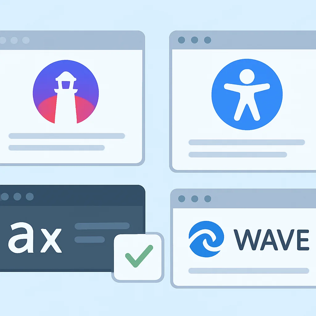
1. Accessibility Testing Tools
Automated tools can catch a significant percentage (around 30-50%) of accessibility issues, particularly those related to WCAG Level A and AA technical requirements. However, manual testing with assistive technologies is still indispensable for comprehensive evaluation.
- Browser Extensions:
- axe DevTools (Deque Systems): A powerful and widely used extension that identifies common accessibility issues directly in the browser. It’s known for its accuracy and detailed explanations.
- WAVE Evaluation Tool (WebAIM): Provides visual feedback about the accessibility of web content by injecting icons and indicators into the page.
- Lighthouse (Google Chrome): Built into Chrome DevTools, Lighthouse audits web pages for performance, SEO, and accessibility. It provides a score and actionable recommendations based on axe-core.
- Screen Readers: Essential for manual testing to understand how visually impaired users experience your site.
- NVDA (NonVisual Desktop Access): Free and open-source for Windows.
- JAWS (Job Access With Speech): Commercial screen reader for Windows, widely used in professional settings.
- VoiceOver: Built-in to macOS and iOS.
- TalkBack: Built-in to Android.
- Color Contrast Checkers: Dedicated tools to verify contrast ratios.
- WebAIM Color Contrast Checker: Online tool for checking foreground and background color combinations.
- Contrast Ratio: Another excellent online calculator.
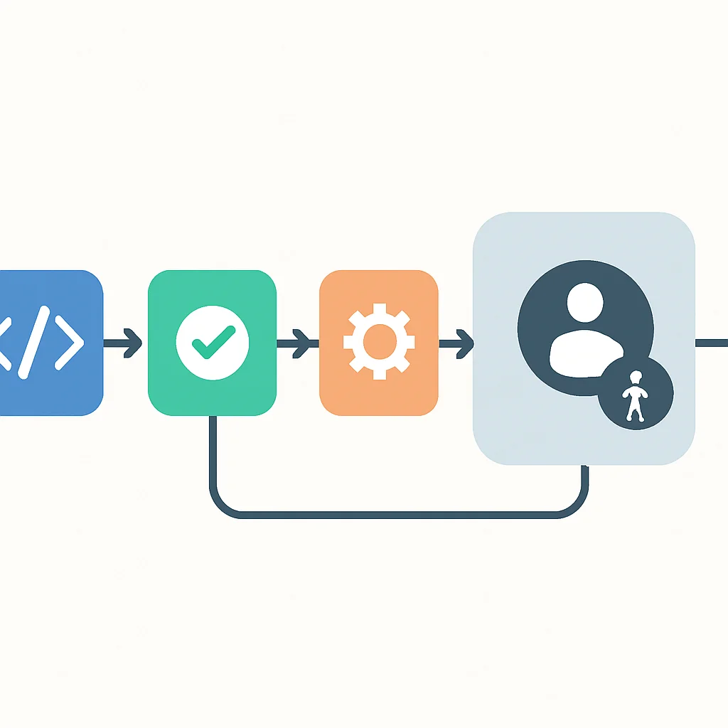
2. Integrating Accessibility into CI/CD
Shifting accessibility testing left in the development lifecycle is crucial. Integrating automated checks into your Continuous Integration/Continuous Deployment (CI/CD) pipeline can catch issues early, saving significant time and resources.
Tools like axe-core (the engine behind axe DevTools) can be integrated into unit tests, end-to-end tests (e.g., with Playwright or Cypress), or as a standalone step in your build process. This ensures that accessibility regressions are identified before reaching production.
CODE EXPLANATION
This is a simplified example of how axe-playwright could be used within an end-to-end test to check for accessibility violations on a page.
// example.spec.js (using Playwright and axe-playwright)
import { test, expect } from '@playwright/test';
import AxeBuilder from '@axe-core/playwright';

test.describe('Homepage accessibility', () => {
  test('should not have any detectable accessibility issues', async ({ page }) => {
    await page.goto('https://kwonglish.com'); // Replace with your target URL

    const accessibilityScanResults = await new AxeBuilder({ page }).analyze();

    expect(accessibilityScanResults.violations).toEqual([]);
  });
});
KEY POINT
Automated accessibility tools (like axe DevTools, Lighthouse) are excellent for catching a baseline of issues in CI/CD, but they must be complemented by manual testing with screen readers and keyboard navigation for comprehensive coverage.
Frequently Asked Questions (FAQ)
Q. What is WCAG 2.2 and why is it important in 2026?
WCAG 2.2 (Web Content Accessibility Guidelines) is the latest recommended standard for web accessibility, building upon previous versions with new criteria, particularly for mobile and cognitive accessibility. In 2026, it serves as the primary benchmark for legal compliance and best practices globally, ensuring a more inclusive digital experience for everyone.
Q. Can AI tools fully automate web accessibility?
While AI tools can assist in identifying many accessibility issues, they cannot fully automate the process. Human judgment is essential for evaluating context and ensuring that all users can interact with web content effectively.