

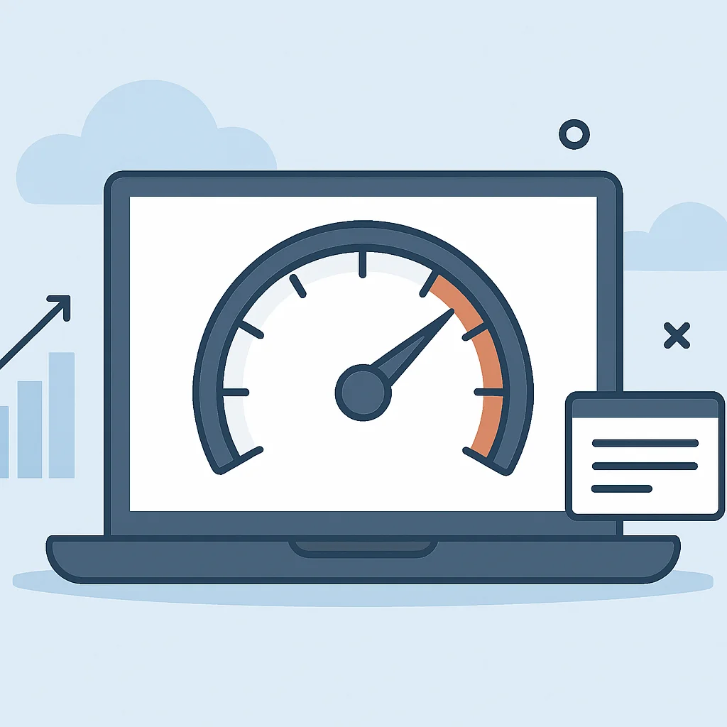
Make your website lightning-fast and keep users engaged with proven performance strategies.
In today’s digital landscape, a slow website is a lost opportunity. This guide from Kwonglish will walk you through essential web performance optimization techniques for 2026, helping you boost user experience, SEO, and ultimately, your site’s success.
Contents
01Why Web Performance Matters in 2026
02Core Strategies for Faster Websites
04Efficient CSS and JavaScript Delivery
05Leveraging Browser Caching and CDNs
06Server-Side Optimization Techniques
07Tools for Measuring and Monitoring Performance
Why Web Performance Matters in 2026
In the rapidly evolving digital landscape of 2026, user patience is shorter than ever. Studies show that a delay of just one second in page load time can lead to a 7% reduction in conversions, 11% fewer page views, and a 16% decrease in customer satisfaction. For e-commerce sites, this translates directly to lost revenue, while content sites risk losing readers and engagement.
Beyond user experience, search engine optimization (SEO) heavily favors fast-loading websites. Google, for instance, explicitly uses page speed as a ranking factor, especially with its Core Web Vitals metrics. A high-performing site is more likely to rank higher, attracting more organic traffic.
The core reason to prioritize web performance in 2026 is simple: it directly impacts your bottom line and digital visibility.
Consider the mobile-first indexing approach by search engines. With over 60% of global website traffic coming from mobile devices, optimizing for speed on these platforms is not just an advantage, but a necessity.
Understanding Core Web Vitals
Google’s Core Web Vitals (CWV) are a set of real-world, user-centric metrics that quantify key aspects of the user experience. Improving these metrics is crucial for both user satisfaction and SEO in 2026. The three main metrics are:
- Largest Contentful Paint (LCP): Measures perceived load speed. It marks the point in the page load timeline when the page’s main content has likely loaded. An ideal LCP score is 2.5 seconds or less.
- First Input Delay (FID): Measures interactivity. It quantifies the experience users feel when trying to first interact with the page. An ideal FID score is 100 milliseconds or less.
- Cumulative Layout Shift (CLS): Measures visual stability. It quantifies the amount of unexpected layout shift of visual page content. An ideal CLS score is 0.1 or less.
Core Strategies for Faster Websites
Achieving a fast website requires a multi-faceted approach, tackling various aspects from image delivery to server response times. Here, we’ll dive into the fundamental strategies that yield the most significant performance gains.
Prioritize Critical Rendering Path
The Critical Rendering Path (CRP) refers to the sequence of steps the browser takes to convert HTML, CSS, and JavaScript into pixels on the screen. Optimizing the CRP means minimizing the amount of critical resources and the round trips needed to display the initial view of a page.
This involves inlining critical CSS, deferring non-critical JavaScript, and asynchronously loading resources that aren’t immediately needed for the first paint.
Minify and Compress Resources
Minification removes unnecessary characters from code (like whitespace, comments, and block delimiters) without changing its functionality. Compression, typically using Gzip or Brotli, further reduces file sizes before they are sent from the server to the browser. These techniques are crucial for reducing network payload sizes.
By minifying CSS, JavaScript, and HTML, and enabling server-side compression, you can often reduce file sizes by 30-70%, leading to faster download times.
Optimizing Images and Media

Images often account for the largest portion of a page’s total weight. Improperly optimized images can severely drag down performance. Effective image optimization is a cornerstone of a fast website.
Choose the Right Format and Compression
The first step is selecting the most appropriate image format:
- WebP: Offers superior compression and quality characteristics compared to JPEG, PNG, and GIF. It’s now widely supported across modern browsers and can reduce file sizes by 25-34% compared to JPEGs.
- AVIF: An even newer format offering further compression improvements, often 30-50% smaller than JPEGs at similar quality. Browser support is growing.
- JPEG: Best for photographs and images with many colors. Use progressive JPEGs for a better user experience on slow connections.
- PNG: Ideal for images requiring transparency or sharp lines (logos, icons).
- SVG: For vector graphics like logos and icons. They are resolution-independent and typically very small in file size.
Always compress images without sacrificing perceptible quality. Tools like TinyPNG, ImageOptim, or online services can help with this. For WordPress users, plugins like Smush or EWWW Image Optimizer automate this process.
Implement Responsive Images and Lazy Loading
Responsive images ensure that users receive an image sized appropriately for their device and viewport. This prevents large desktop images from being downloaded on mobile devices.
<picture>
  <source srcset="image-large.webp" media="(min-width: 1200px)" type="image/webp">
  <source srcset="image-medium.webp" media="(min-width: 768px)" type="image/webp">
  <img src="image-small.webp" alt="Description of image" loading="lazy" width="600" height="400">
</picture>
The <picture> element with <source> tags allows browsers to choose the best image based on media queries. The srcset attribute can also be used for similar purposes.
Lazy loading defers the loading of images (and iframes) until they are actually needed, typically when they enter the viewport. This significantly speeds up initial page load times.
<img src="placeholder.webp" data-src="actual-image.webp" alt="A beautiful landscape" loading="lazy">Modern browsers natively support lazy loading with the loading="lazy" attribute. For older browsers or more complex scenarios, JavaScript-based solutions can be used.
Efficient CSS and JavaScript Delivery
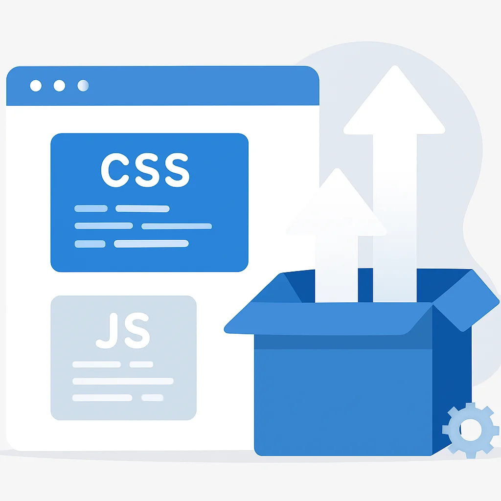
CSS and JavaScript are render-blocking resources. The browser must parse and execute these files before it can render the page content. Optimizing their delivery is critical for improving LCP and FID.
Minify and Combine CSS/JS Files
As mentioned earlier, minification reduces file size. Combining multiple small CSS or JS files into one or a few larger files reduces the number of HTTP requests the browser needs to make, which can significantly speed up loading, especially over slower connections.
While HTTP/2 and HTTP/3 mitigate some of the issues with multiple requests, reducing the total number of files still has benefits, particularly for initial connections and caching efficiency.
Asynchronous and Deferred Loading of JavaScript
By default, JavaScript parsing blocks the HTML parser. You can change this behavior using the async or defer attributes on your <script> tags:
async: Downloads the script asynchronously and executes it as soon as it’s downloaded, without blocking HTML parsing. The order of execution is not guaranteed. Best for independent scripts like analytics.defer: Downloads the script asynchronously but executes it only after the HTML document has been fully parsed. Execution order is guaranteed. Ideal for scripts that depend on the DOM.
<script src="analytics.js" async></script>
<script src="main.js" defer></script>
By using async or defer, you can significantly improve the initial rendering time of your page.
Critical CSS and Code Splitting
Critical CSS refers to the minimum amount of CSS required to render the “above-the-fold” content of a webpage. By inlining this critical CSS directly into the <head> of your HTML, you eliminate a render-blocking request for the external stylesheet. The rest of the CSS can then be loaded asynchronously.
Tools like Critical can automate the extraction of critical CSS.
Code splitting is a technique that breaks down your JavaScript bundles into smaller chunks that can be loaded on demand. This is especially useful for single-page applications (SPAs) or sites with complex, interactive features that aren’t needed on every page view. Frameworks like React, Angular, and Vue.js offer built-in support for code splitting.
Leveraging Browser Caching and CDNs
Once a user visits your site, you want subsequent visits to be even faster. Browser caching and Content Delivery Networks (CDNs) are vital for achieving this by reducing the amount of data that needs to be transferred on repeat visits.
Browser Caching
Browser caching allows a user’s browser to store local copies of your website’s static resources (images, CSS, JS files). When the user revisits your site, the browser loads these assets from its local cache instead of requesting them from the server again. This drastically reduces load times for repeat visitors.
You control caching via HTTP headers, particularly Cache-Control and Expires. For example, in an .htaccess file (Apache), you might set:
<IfModule mod_expires.c>
  ExpiresActive On
  ExpiresByType image/jpg "access 1 year"
  ExpiresByType image/jpeg "access 1 year"
  ExpiresByType image/gif "access 1 year"
  ExpiresByType image/png "access 1 year"
  ExpiresByType text/css "access 1 month"
  ExpiresByType application/javascript "access 1 month"
</IfModule>
Properly configured browser caching can reduce page load times by 50% or more for repeat visitors.
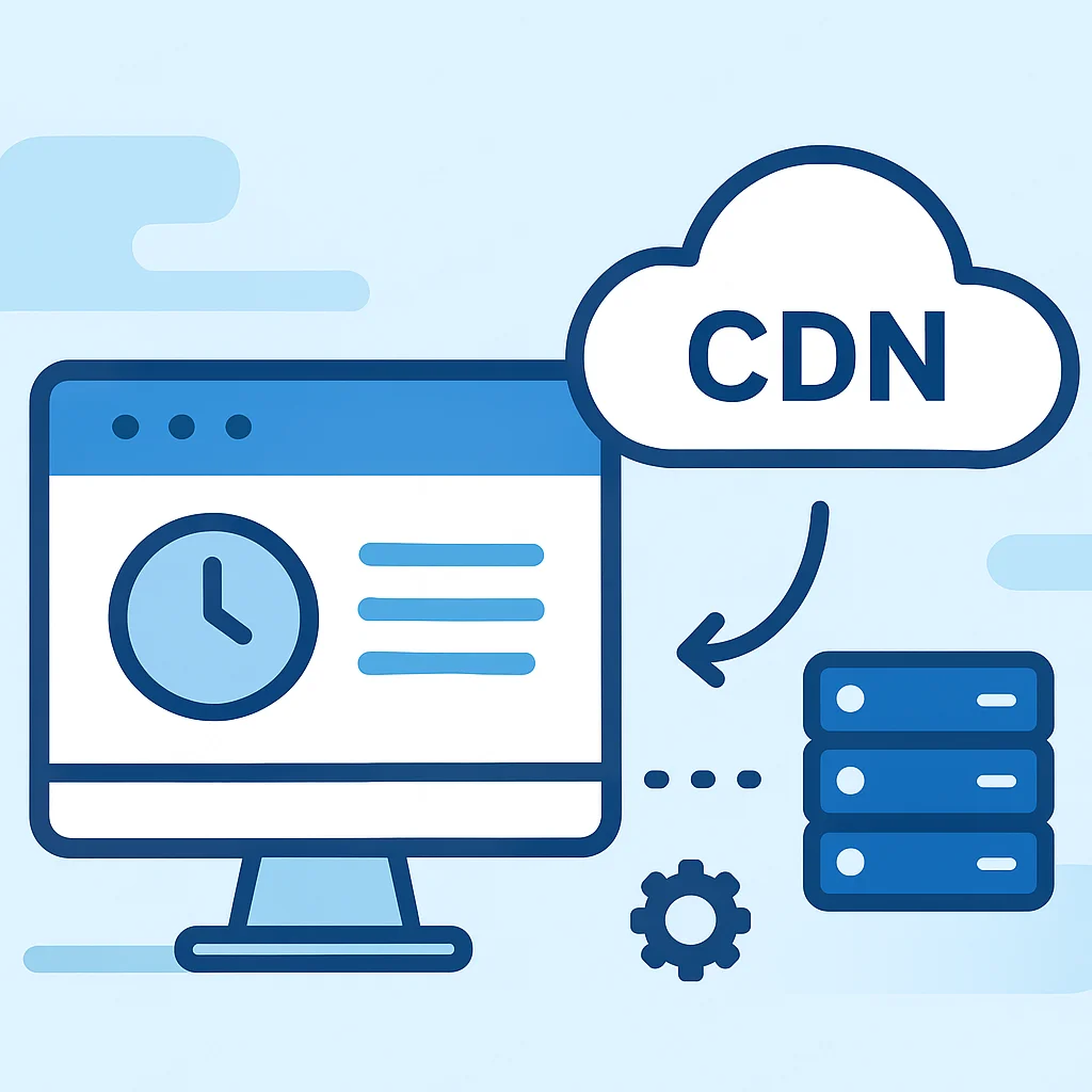
Content Delivery Networks (CDNs)
A CDN is a geographically distributed network of servers that cache your website’s static content. When a user requests your site, the CDN delivers the content from the server closest to them, reducing latency and speeding up delivery. Popular CDNs include Cloudflare, Akamai, and Amazon CloudFront.
CDNs are particularly beneficial for global audiences, as they minimize the “distance” data has to travel. They also help absorb traffic spikes, improving site reliability.
Server-Side Optimization Techniques
While client-side optimizations are crucial, the server’s performance is the foundation. A slow server response time can negate many client-side efforts. Optimizing your backend infrastructure is therefore essential.
Optimize Database Queries
For dynamic websites (e.g., WordPress, e-commerce platforms), database queries are a common bottleneck. Inefficient queries can significantly increase server response times. Ensure your database queries are optimized, indices are properly used, and unnecessary data retrieval is avoided.
Regularly review your database performance, especially if you experience slow loading times on pages that fetch a lot of dynamic content.
Server-Side Caching
Beyond browser caching, implementing server-side caching can dramatically reduce the load on your server and speed up dynamic page generation. This involves storing the output of dynamic pages (or parts of them) in memory or on disk, so the server doesn’t have to regenerate them for every request.
- Page Caching: Stores entire HTML pages.
- Object Caching: Stores database query results or other computed objects.
- Opcode Caching: Caches compiled PHP code to avoid recompilation on every request.
Tools like Varnish, Redis, Memcached, or WordPress caching plugins (e.g., WP Super Cache, LiteSpeed Cache) can implement server-side caching, potentially reducing server response times by 80% or more.
Choose a Fast Hosting Provider
The foundation of good server performance is a reliable and fast hosting provider. Shared hosting can be economical but often comes with performance limitations. Consider upgrading to a Virtual Private Server (VPS), dedicated server, or managed WordPress hosting for better performance, especially for high-traffic sites.
Look for hosts that offer modern server hardware, SSD storage, HTTP/3 support, and integrated caching solutions.
Tools for Measuring and Monitoring Performance
You can’t optimize what you don’t measure. Regular monitoring and testing are essential to identify bottlenecks and track the impact of your optimizations. Here are some indispensable tools:
Google PageSpeed Insights & Lighthouse
Google PageSpeed Insights (PSI) analyzes your website’s content and generates suggestions to make that page faster. It provides both lab data (Lighthouse) and field data (CrUX) for your Core Web Vitals, giving you a comprehensive view of your site’s performance for both desktop and mobile.
PSI is a great starting point for identifying major issues and getting actionable recommendations. Aim for scores above 90 for optimal performance.
Lighthouse is an open-source, automated tool for improving the quality of web pages. You can run it against any web page, public or requiring authentication. It has audits for performance, accessibility, progressive web apps, SEO, and more. It’s integrated into Chrome DevTools, making it easy to use during development.
GTmetrix and WebPageTest
GTmetrix provides detailed insights into your page’s performance, offering scores for various metrics, a waterfall chart of resource loading, and recommendations. It uses Lighthouse and Google PageSpeed Insights metrics to generate a comprehensive report.
WebPageTest is a powerful tool for advanced users. It allows you to run tests from multiple locations around the world using real browsers and provides detailed waterfall charts, video capture of page loading, and optimization checklists. It’s excellent for diagnosing complex performance issues and testing specific scenarios.
Regularly using these tools will help you stay on top of your site’s performance and ensure continuous improvement.
Common Pitfalls and Best Practices
While optimizing for speed, it’s easy to fall into common traps. Being aware of these and following best practices will help you achieve sustainable performance gains.
Beware of Over-Optimization
Warning: While optimizing is good, over-optimization can sometimes lead to diminishing returns, increased complexity, or even broken functionality. For example, aggressively inlining too much CSS or JavaScript can make your initial HTML payload larger than necessary, or using too many lazy-loading scripts can cause content to “jump” as it loads, hurting CLS.
Always test thoroughly after implementing any optimization to ensure it doesn’t negatively impact the user experience or site functionality.
Impact of Third-Party Scripts
Third-party scripts (analytics, ads, social media widgets, chat tools) are often major contributors to slow page loads. While many are essential, they can introduce significant overhead, making your site dependent on external server performance.
Best Practices:
- Load third-party scripts asynchronously or defer them.
- Host popular libraries (like jQuery) locally if your CDN isn’t faster.
- Audit and remove any unnecessary third-party scripts.
- Consider self-hosting some common scripts if licensing allows.
Mobile-First Mindset
Always design and optimize with a mobile-first approach. Mobile networks are often slower, and device resources are more limited. What performs well on a desktop might crawl on a smartphone.
Test your site regularly on various mobile devices and network conditions. Tools like Chrome DevTools’ network throttling can simulate different connection speeds.
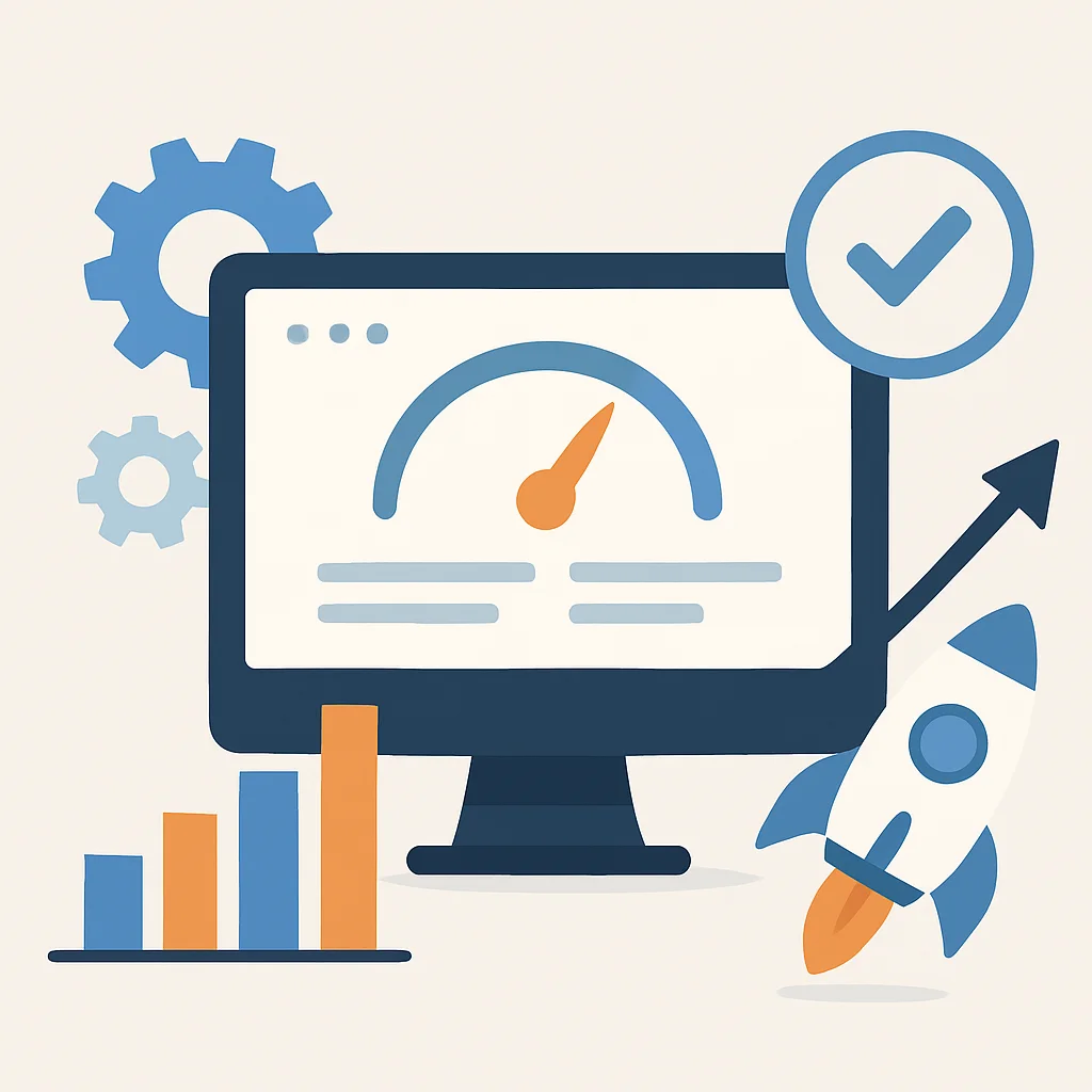
Key Takeaways for a Faster Website
Optimizing your website for performance is an ongoing process, not a one-time task. The web is constantly evolving, and so should your optimization efforts. By consistently applying the strategies discussed, you can ensure your website remains fast, responsive, and competitive in 2026 and beyond.
Remember, a faster website isn’t just a technical achievement; it’s a direct investment in your user experience, SEO, and business growth.
Start by auditing your current performance, implement changes incrementally, and always measure the impact. Small, consistent improvements can lead to significant gains over time.
Ready to supercharge your site’s speed?
Start implementing these tips today and watch your Kwonglish site soar past the competition. Share your performance wins in the comments!